A few years ago you could rescue a weak ad with clever targeting. That lever has mostly gone. With broad audiences and Advantage+ delivery, Meta decides who sees your ad by watching who responds to it. Facebook ad creative is now the biggest single factor you control.
This guide is a working method, not a gallery of pretty ads. It moves from the brief to angles, formats, copy, sizes, testing and fatigue, in the order you would actually make an ad.
Start with a one-page brief
Most bad ads come from starting in Canva. Ten minutes on a brief saves days of redesigning. Answer these on one page:
- Who is it for?
- One buyer, described as a person. “Working women aged 25 to 35 in Dhaka who buy office wear online” beats “women”.
- What do they want?
- The outcome, not the product. Comfortable clothes for a long office day, not “cotton kurti”.
- What stops them buying?
- Doubts about fit, quality, delivery, price or trust.
- Why you?
- One honest reason: better fabric, faster delivery, a size exchange, a local maker.
- What is the offer?
- Price, bundle, free delivery, a limited collection.
- What should they do?
- Order on the site, send a message, call, book.
If you cannot fill in “what stops them buying”, ask your sales staff or read your inbox. Those objections are the raw material for your best ads.
Pick angles before designs
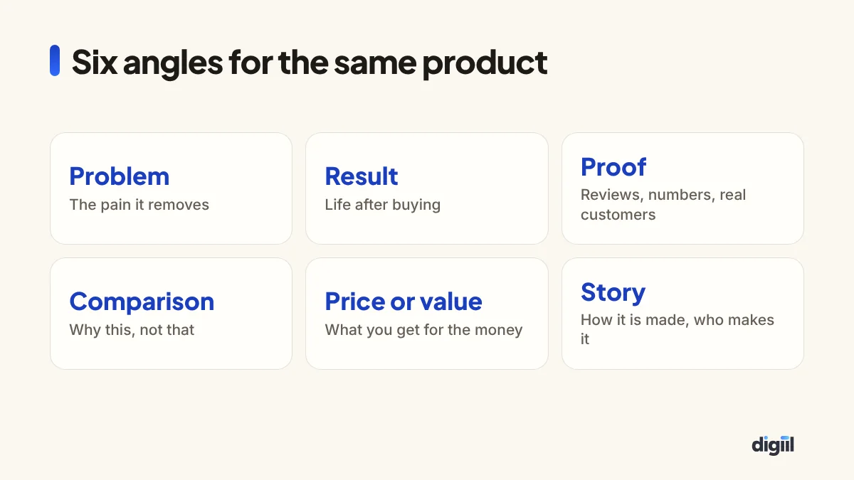
An angle is the reason the ad gives for buying. The same product can be sold in at least six different ways, and each attracts a slightly different person. Urgency, such as a season, limited stock or a deadline, can be added to any of them. Test angles first, because the difference between angles is usually much bigger than the difference between two colours of the same design.
Problem: “Still boiling water every night?” with a tired parent at a stove.
Proof: a technician testing tap water before and after, with the reading on screen.
Value: “Less than the cost of bottled water for a family of four”, with a simple price breakdown.
Each brings in different buyers. The one with the lowest cost per order becomes the base for the next round.
Choose the format
Short video
The default for most products today. Vertical video fits Reels and Stories, where a large share of delivery now happens. It does not need a studio: product in use, unboxing, a person explaining, a process. See Reels marketing for structures that sell.
User-generated style video
Filmed on a phone by a customer or creator, talking naturally about the product. It looks like a post from a person rather than an advert, which is why it often holds attention. Get permission and make sure any claims are true.
Static image
Fast to make and still effective, especially for clear offers, retargeting and products whose appeal is visible in one frame. A strong photo with a short line of text beats a busy collage.
Carousel
Several cards in one ad. Good for showing a range, steps of a process, or several benefits. Put the strongest card first.
Catalogue ads
For stores with many products, Meta builds the ad from your product feed, often showing each person items they viewed. They work best alongside creative-led ads, not instead of them.
Design that stops a thumb
- The product in the first second, large and clear. People should know what is being sold before they decide to scroll.
- Real people and real settings usually beat stock images.
- Contrast against the feed: a bright subject on a clean background.
- Short text on the image, readable on a small screen. Meta no longer blocks text-heavy images, but heavy text still tends to perform worse.
- Captions on video, because many people watch muted.
- Your brand visible but not dominant. A logo in the corner, not a three-second logo animation.
Copy that sells
A Meta ad has three text fields. The primary text sits above the media. The headline sits below it, next to the button. The description appears in only some placements. Only the start of the primary text shows before “See more”, so the first line carries the weight.
Three formulas that work
Problem, solution, proof, action.
Back pain after long hours at the desk? Our ergonomic chair supports your lower back and adjusts to your height. Over 2,000 chairs delivered across Bangladesh, with a 7-day trial. Order today, free delivery in Dhaka.
Before, after, bridge. Describe life now, life after, and the product as the bridge.
Offer first. For retargeting and promotions: “Eid collection: buy two panjabis, get free delivery. Sizes S to XXL. Ends Friday.”
In each, use the numbers you can prove. If “2,000 chairs delivered” is not true for you, do not write it. Replace it with a review quote or a guarantee that is.
Language
Write the way your buyers talk. For many Bangladeshi audiences, simple Bangla or Banglish outperforms polished English. For premium, corporate or expatriate audiences, English may fit better. Test both if you are unsure. AI tools can produce first drafts and variations quickly. See ChatGPT for business, but always edit for your own voice and verify every claim.
The headline and button
Keep the headline short and concrete: the product and the offer. Choose a button that matches the next step. “Send message” for inbox sales, “Shop now” for a store, “Book now” for appointments.
Sizes and safe zones
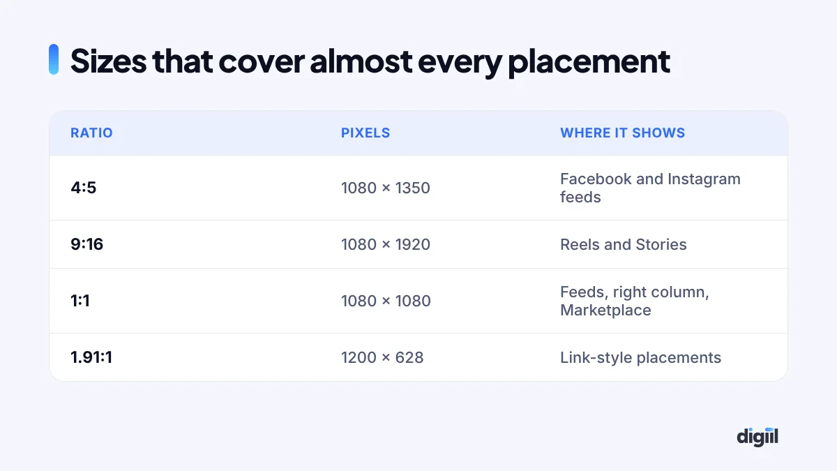
Upload a 4:5 and a 9:16 version of each ad and let Meta use the right one per placement. In 9:16, keep text and faces away from the top 14% and the bottom 20% or so of the frame, where the app places profile names, captions and buttons. Preview every placement in Ads Manager before publishing.
Testing without wasting money
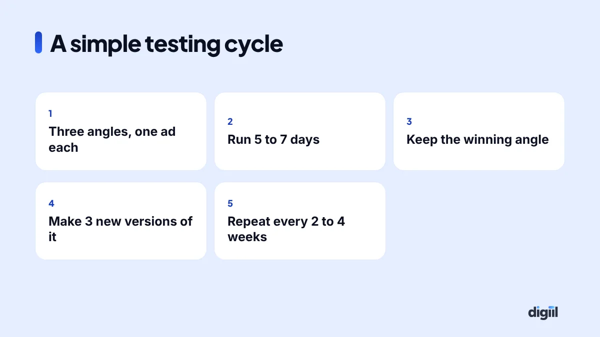
Big accounts run formal experiments. Small accounts need something simpler and more forgiving.
- Put three ads with different angles in the same ad set.
- Let them run for five to seven days without editing.
- Judge by cost per purchase or qualified lead, not by clicks or likes.
- Keep the winning angle and make three new versions of it: a different hook, a different format, a different first line.
- Turn off clear losers. Leave close results running a little longer.
Adding new ads restarts some of the learning, so add them in batches rather than one a day. Each batch of new ads sends the ad set back into a short learning period, which is why daily changes make results hard to read. Our targeting guide explains how delivery decides who sees each version.
In ad accounts we take over, the same pattern repeats. One designed image has run for months, cost per result has crept up, and the first fix everyone tried was a new audience. The fix that works is almost always new creative. We keep at least three different angles live in each ad set and add a fresh one every week or two.
Creative fatigue
Every ad wears out as the same people see it again and again. The signs: frequency climbing, click-through rate falling, cost per result rising, and comments like “this again”. In small audiences it happens within weeks. In large ones it takes longer.
Plan for it. Keep a list of angles and ideas, and make new versions before the current winner tires. Refresh the hook and the first three seconds first. Often that is enough to give a winning ad a second life.
Advantage+ creative and AI tools
Meta offers automatic enhancements: cropping to fit placements, adjusting brightness, adding music, generating text variations and backgrounds. Some help, some do not suit every brand. Turn them on in a test, preview what Meta shows, and keep only the ones that represent your product accurately.
Policy traps
Ads that break Meta’s rules get rejected, and repeated rejections can restrict the account. The common ones for small businesses:
- Personal attributes: “Are you overweight?” or “Struggling with debt?” implies you know something about the viewer. Rephrase around the product.
- Health and weight-loss claims, especially before-and-after images and promises of specific results.
- Exaggerated income or financial claims.
- Fake buttons, misleading play icons or clickbait.
- Using other brands’ logos or celebrities without permission.
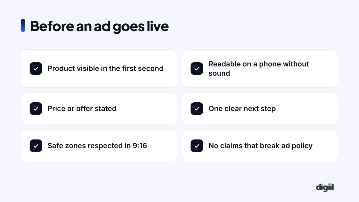
If an account is restricted, see what to do when a Facebook ad account is disabled.
Why good-looking ads still fail
When an ad looks great and sells nothing, the cause is usually one of these:
- It is beautiful but unclear. People cannot tell what is being sold.
- It speaks to everyone, so it speaks to no one.
- The offer is weak or the price is hidden.
- The landing page or inbox experience after the click is slow or confusing.
- The product itself is not competitive at that price.
Creative can only amplify a good offer. It cannot fix a bad one. For how much to spend while you test, see setting a digital marketing budget.
Your next three ads
Write a one-page brief. Pick three angles from the list. Make one short vertical video and one 4:5 image for each. Run them together for a week, then build on the winner. If you would like help with design and production, see our graphic design service and Meta ads management, or book a free 15-minute strategy call.
Creative and copy questions
What are the best Facebook ad sizes?
Use 4:5 (1080 x 1350) for feeds and 9:16 (1080 x 1920) for Reels and Stories. Upload both versions in the same ad so each placement gets the right shape.
How long should Facebook ad copy be?
Long enough to answer the buyer's main questions and no longer. Only the first line or two show before "See more", so put the hook and the offer there. Longer copy can work for considered purchases when every line is useful.
How many ads should I run in one ad set?
Three to six distinct ads is a practical range for most small accounts. More than that splits spend so thinly that you cannot tell what works.
How often should I change my creative?
When results drop and frequency rises, usually every two to six weeks depending on budget and audience size. Prepare new versions before the old ones wear out.
Should I turn on Advantage+ creative enhancements?
Test them. Some enhancements, such as automatic cropping and brightness, are usually harmless. Others change text or add elements, so preview the result and turn off anything that misrepresents your brand.

Amanat has 7+ years in digital marketing and has managed $8M+ in Google and Meta ad spend for 235+ brands in the UK, USA, Australia and Bangladesh. He holds 20+ certifications, including Digital Marketing Strategy from Harvard Business School Online. More about Amanat